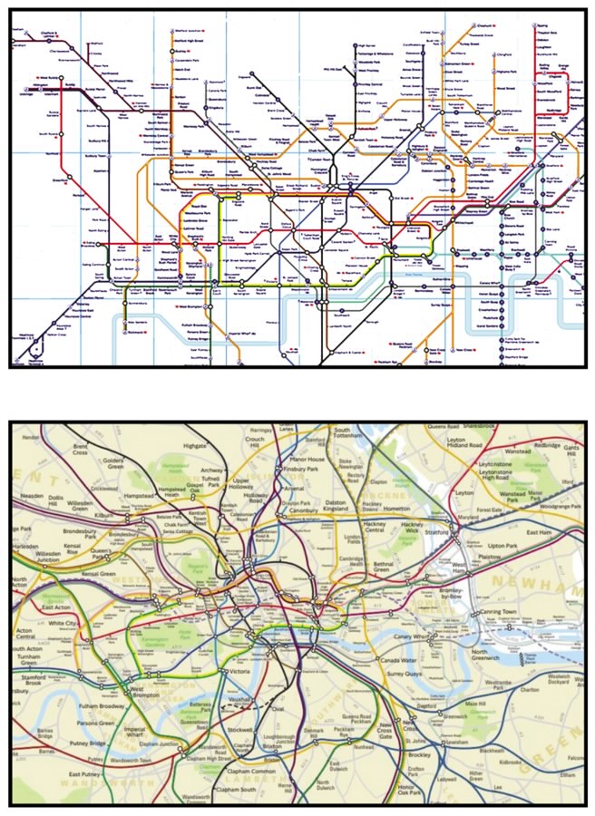
Spaghetti Junctions
How did New York become the only metropolis in the world to insist that its transit map reflect the layout of the city above?
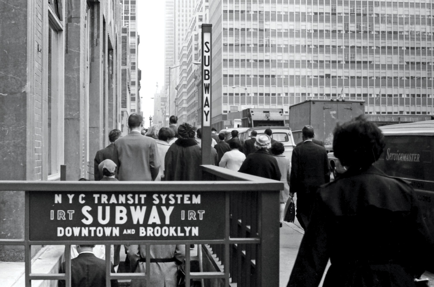
Pedestrians exit a subway stop in Midtown Manhattan, 1965. The acronym “IRT” on the sign refers to one of the two private transit agencies that fought against the city-owned IND for dominance in New York City prior to their takeover — amid bankruptcy — by the municipal government in 1940. (Getty Images)
Among the world’s metropolitan transit systems, the New York City Subway has the most stations, the most riders, and the ugliest map.
In 1972, the new Metropolitan Transportation Authority (MTA brought in a striking, colorful diagram masterminded by the Italian designer Massimo Vignelli. In 1979, it was replaced by a mostly geographically accurate map under the auspices of the MTA’s John Tauranac. Since then, generations of urban Europeans, Asians, and South Americans accustomed to rational transit maps have found, to their amazement and horror, that in order to find where they want to go, they have to study an enormous map showing every damn twist and turn of every tunnel, with outlines of the main streets beneath — an avalanche of information. Nowhere else in the world makes transit maps like this. What happened?