Here Is One Graph Everyone Should See on Labor Day
On this Labor Day, remind everyone you can that if we hope to ever rebuild an economy that works for everyone, we’re going to need many more workers in unions and a much stronger labor movement.
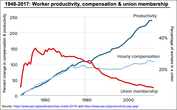
With fewer unions, workers’ productivity gains which had previously been compensated instead were pocketed by owners.
Here is the one graph everyone should see on Labor Day:
This graph comes from the Economic Policy Institute (EPI) — it shows the relationship between union density and the percentage of national income going to the richest 10 percent of Americans. As you can see, the larger the share of the American workforce that’s unionized, the lower the share of national income goes to the super-rich — and vice versa.
I’ve also combined the union density graph with another from EPI showing the break between worker productivity gains and worker compensation gains. Look at the story it tells about what happened between 1948 and 2017.