The Cataclysmic Iraq War in 6 Charts
The US invaded Iraq 20 years ago this spring. From killing hundreds of thousands of civilians to redistributing wealth to the rich and powerful, it was an unmitigated disaster. These charts show how.
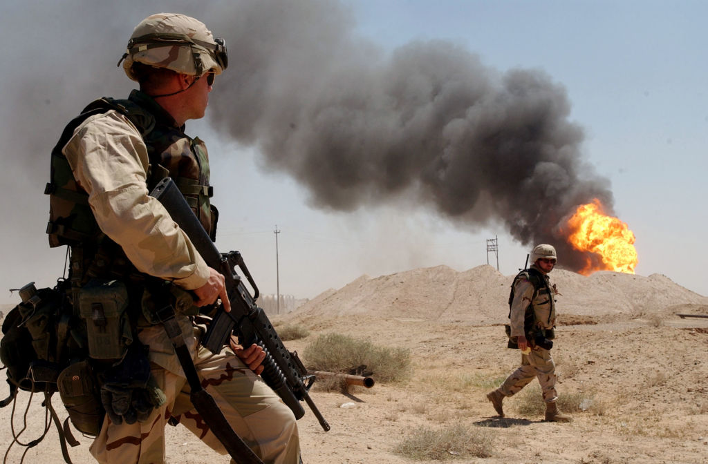
Members of the US Army on duty near a burning oil well in the Rumaylah Oil Fields in Southern Iraq, April 2, 2003. (Arlo K. Abrahamson / US Navy / Getty Images)
Speaking recently about Russia’s criminal invasion of Ukraine, Joe Biden said: “The idea that over 100,000 forces would invade another country . . . since World War II, nothing like that has happened.” He must have a short-term memory.
US-led coalition forces in Iraq easily eclipsed one hundred thousand every year from 2003 to 2009, during which time Biden was either vice president of the United States or the chairman or ranking member of the Senate Foreign Relations Committee. As the following charts demonstrate, twenty years on, Biden is as connected to the Iraq War and its legacy as any active politician.
Imperial Violence
Iraq should be an upper-middle-income country by now. Instead, it’s a fragile, poor state missing a sizable portion of its population thanks to the 2003 invasion that Biden ardently supported.