The Printing House of the Commune

During the Paris Commune, workers at France’s National Printing House took the same fonts once used by kings and emperors and repurposed them to print the demands of worker rule.


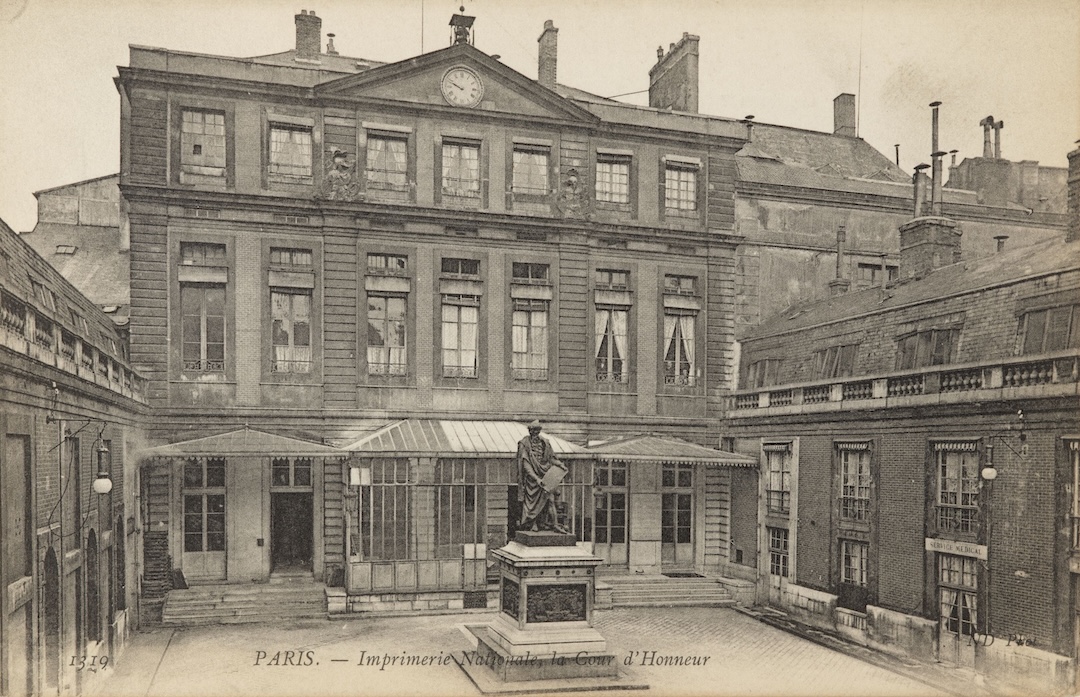
The interior courtyard of the Hôtel de Rohan that housed the State Printing House of France from 1808 until 1921. (Musée Carnavalet, Histoire de Paris.)

The Paris Commune is known for many things, but typography isn’t one of them. Despite the many posters, tracts, and the extensive archive of a daily newspaper that remain, these printed documents do not stand out from the mass of nineteenth-century typography. After all, the Commune governed Paris for only a little over two months in the spring of 1871. Any distinct visual culture that it might have developed was cut short by violent counterrevolution. However, even in its short existence, the Paris Commune managed to provide an example of a more just, democratic, and equal society for generations to come. And while many typographers who sided with the Commune took up arms to defend its principles, there were those who saw their trade as a more important tool of the revolutionary regime. They typeset, printed, and disseminated thousands of posters and tracts at the most prestigious printing facility in France, the National Printing House, while also changing it from within.

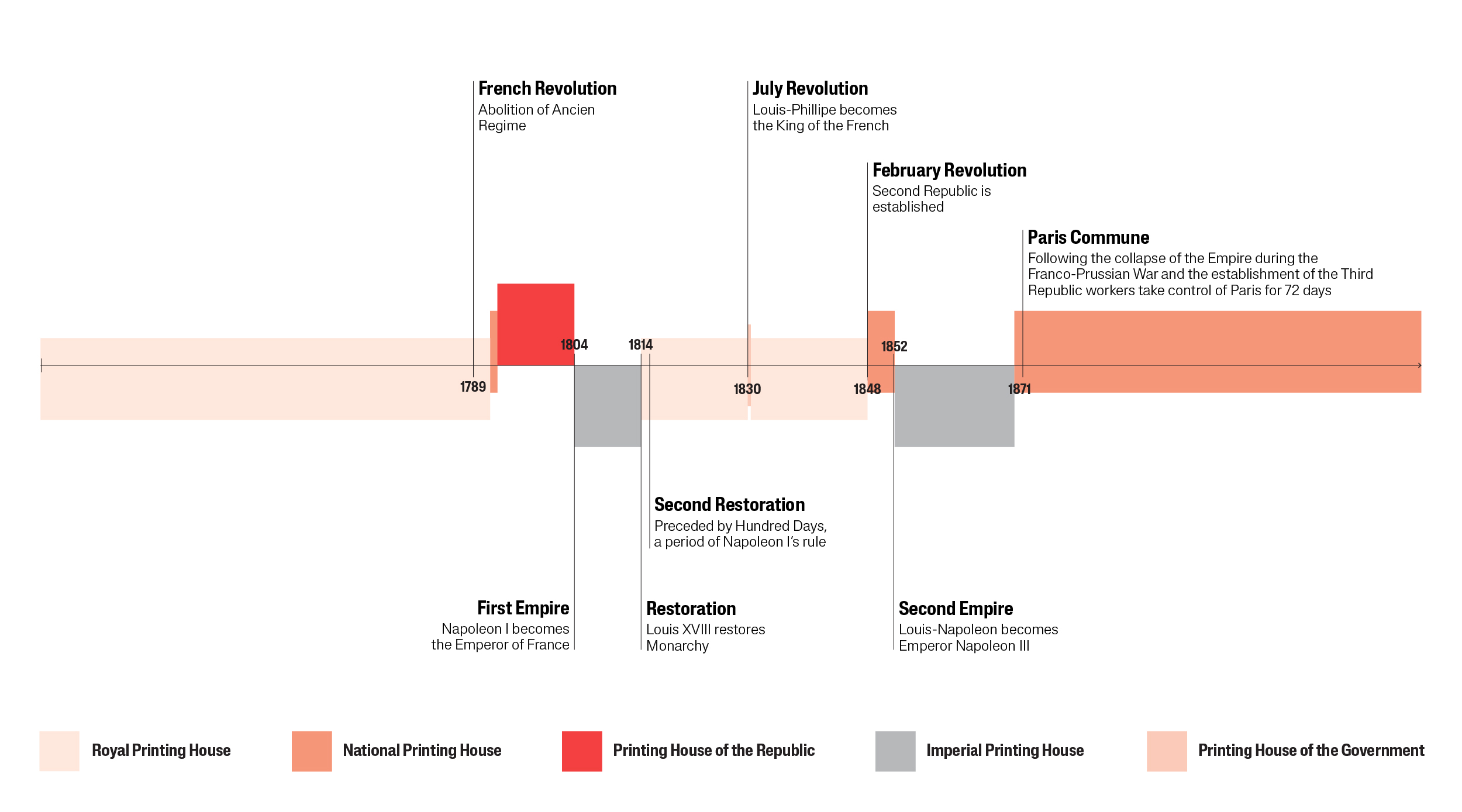
The National Printing House was not always called that. Throughout its history, it changed names to reflect the ruling regimes. Founded as a Royal Printing House in 1640, it was briefly renamed the Printing House of the Republic following the 1789 French Revolution. It took two more revolutions before it finally became the National Printing House in 1848, only to be renamed the Imperial Printing House under Napoleon III and to regain the title “National Printing House” after the collapse of the Second Empire in 1870. But it was during the Commune that, for the first time in its history, the National Printing House was supervised by a worker-typographer. During this brief period, the historic institution was restructured to introduce self-management, the abolition of penalties, the replacement of piecework wages with weekly wages, and a simplification of hierarchy. 

The official title of the State Printing House of France over time.

While most administrative workers chose to leave when given the opportunity, the manual workers — such as compositors, printers, founders, draftsmen-lithographers, workers in ancillary roles (binding, ruling, brochures, etc.), and laborers — numbering about one thousand people, overwhelmingly chose to stay. These workers produced posters daily of the highest printing quality, using top-tier equipment, while gaining back their dignity and democratic rights. In the end, what is interesting in the typography of the Paris Commune isn’t what was different but rather what remained the same: the same proprietary fonts of the State Printing House, now used to spread the messages of self-governance and radical communalism, under improved and dignified working conditions.

Revolution in Typography

Revolutions in politics and typography rarely align, but there are moments when one catches up to the other. The Paris Commune wasn’t the first time in French history when a revolutionary regime embraced the potential of typography created under its conservative opponents. A century before the French Revolution established the First Republic in 1792, Louis XIV sought to mark his reign with a proprietary font to be used by the Royal Printing House. The resulting “Romain du Roi” perfectly channeled the spirit of the Enlightenment with its geometric logic and scientific precision. Scholars, typographers, and members of the newly established Academy of Scientists studied traditional calligraphy, as well as existing movable type, to construct a new, more rational, and modern font. With its high contrast, straight stems, and symmetric construction, Romain du Roi was a radical design. So much so that when the French Revolution abolished the monarchy, the royal typography was not discarded; rather, it found a new use in the printing of assignats — proto-banknotes tied to the value of nationalized Crown and Church property. As Robin Kinross notes in his essay on the modern typography, with its “shedding of rococo baggage, a return to fundamentals, and to the order of the classical age, king’s typeface was indeed entirely appropriate as the style of the new republic in France.”

Not only did Romain du Roi remain in use throughout the First Republic, but it also influenced French typography for decades to come. Taking visual cues from it, in 1812, Napoleon I commissioned a new font to match his imperial ambitions, “Romain de l’Empereur.” Designed by Firmin Didot, it was based on a metric grid and pushed the rationality of its design to a new extreme. It retained a curious detail from Romain du Roi: a small spur on the left side of the lowercase “l.” This nod to the calligraphic tradition soon became the proprietary mark of the State Printing House. Criticized for its mechanical rigidity, Firmin Didot’s imperial font had a short run, just as new trends in commercial typography were making their way from Great Britain. 

In 1818, under the restoration regime of Louis XVIII, royal typographer Jacquemin worked on a new set of proprietary fonts referred to as “London characters,” featuring bolder and more contrasted letters. Some of the punches for these fonts were likely produced in England by the Fry foundry, then customized and supplemented with additional letters, including the signature lowercase “l.” But the trendy London characters with their exaggerated and robust forms weren’t universally accepted, and in 1825, to mark the ascension of Charles X to the throne, a new set of characters was issued. 

Inspired by the process behind Romain du Roi, a new commission was formed to study and develop the latest proprietary font. At the head of this commission was Marcellin-Legrand, who, although not opposed to the typographic innovations of his time, reverted to the classical elegance of Grandjean’s Romain du Roi and Didot’s Romain de l’Empereur. By the mid-century, this font, too, was considered outdated. So in 1847, Marcellin-Legrand, still a royal typographer, redesigned some of its characters, notably introducing a “binocular g,” a historic reference to a shape popularized earlier by Firmin’s nephew, Jules Didot.

The proprietary fonts of the State Printing House of France over time.

Mazas Typographique

While the official fonts of the State Printing House changed every decade or so to reflect the changing regimes, the working conditions there consistently stayed poor. And if the nineteenth century’s industrialization brought new processes and machines to the Royal Printing House, little progress was made for the workers’ rights, which inevitably stirred resentment towards the mechanization. In the heated days of the 1830 Revolution, a group of Parisian typographers entered the premises of the Royal Printing House and broke down its Stanhope machines. Yet this Luddite rebellion achieved little, and soon after typographers were forced to repair the machines. New internal order enforced discipline in the workshops, earning the State Printing House the nickname “Mazas typographique,” after the name of the Parisian prison.

In charge of the National Printing House were usually educated elites — diplomats, historians, and scientists, who understood the strategic role of the printing facility but lacked the hands-on experience of typographic workers. Whether Republicans or royalists, they used the State Printing House to advance the interests of the regime to which they were loyal, without seeking to change the institution’s organizational structure. From printing the announcement of the first full male suffrage election of 1848 to the posters prepared by conspirators during the coup d’état of December 2, 1851, which would restore the empire, the State Printing House played an important role in the turbulent politics of the century. But its internal structure remained extremely hierarchical, with rampant favoritism and rigid discipline.

The Takeover of the National Printing House

During the 1870 war and the first siege of Paris, the National Printing House specialized in the production of official posters for various functions: government decrees, notices to the Parisian population, ministerial orders concerning the price and distribution of foodstuffs during the siege, and government encouragement to resist the siege and bombardments. The quality of its work, its availability, and its docility made the National Printing House essential to the republican government. The posters were all the more crucial for informing Parisians as the siege cut the capital off from the rest of the country; they allowed the embattled population to stay informed of the government’s actions and the course of the war. And when, on March 18, the insurrection began in Paris, it was at the National Printing House that the posters demanding the National Guard “seize the arms that some want to turn against Paris” were printed.  

To prevent further notices like this from being spread, on the very same day, before even the city hall was surrounded, the 86th Battalion of the National Guard, under the command of Lieutenant Louis-Guillaume Debock and Jean-Louis Pindy, entered the National Printing House. That night, pro-Commune posters were printed and distributed from the same facility.

Left: Poster demanding National Guards reestablish order. Right: Poster announcing municipal elections during the Commune. (Musée Carnavalet, Histoire de Paris.)

In the following days, the director and the upper management of the National Printing House were dismissed, but the remaining personnel were free to stay or leave. Their decision largely depended on their rank — the administrative workers, who had fixed salaries, were more likely to feel loyalty to the government and fled, while the manual workers, who worked on piece wages, were more concerned with making ends meet. To persuade the manual workers to quit, the administrative personnel spread a rumor that the central committee of the National Guard didn’t have the means to pay them. This was quickly repudiated by the Communards, who procured advance payments and appealed to the workers’ class consciousness.

For the first time in its history, the upper management of the National Printing House consisted of three manual workers. The director, Louis-Guillaume Debock, was a typographer, a militant republican, a veteran of the 1848 revolution, and one of the first members of the Parisian office of the International Workingmen’s Association. He was a leader in the worker movement and a typographer by trade, making him a perfect fit for the director’s position. His son, Georges, also a worker typographer, served as the secretary, and André Alavoine, a son of a National Printing House worker and a radical member of the First International, became a deputy director.

Two Typefaces of the Paris Commune

While some of the other functions of the National Printing House, such as printing scientific works, and administrative documents were temporarily halted, the production of posters was prioritized and reached five to six designs a day, which required an almost uninterrupted activity of compositing, correction, printing, and distribution. The posters were numbered and marked “Imprimerie Nationale” to indicate where they were printed, as was common practice at the time. But what distinguished them was also the superior quality of the printing, highly legible layouts with generous breathing room, and refined typography that featured a signature marker of the State Printing House — the spur on the lowercase “l”. 

The text of the posters was set in Jacquemin’s London characters. These robust letters that we now know by the term “fat face” weren’t always well-regarded and instead have a history of being looked down on as vulgar and anomalous. When describing the font, one director of the National Printing House didn’t spare words by calling the forms of the letters “monstrous and bizarre.” Yet he admitted that upon further study in legibility the fonts can be quite useful for reading at long distances. The style gained prominence throughout the nineteenth century, as more and more posters were printed to be read collectively and usually at a distance, it’s thick weight and wide proportions proving to be an asset. And so during the Paris Commune hundreds of posters set in the fonts commissioned for the Imperial Printing House dotted the small streets of Paris, announcing elections, military updates, funerals, and revolutionary measures undertaken by the Commune — abolition of conscription, postponement of commercial deadlines, remission of rents due for the period of the siege — to a public hungry for information.

However, not everything printed during the Paris Commune was intended for the city walls. For some documents, particularly those addressed to the populations outside of Paris, a different format was needed and so a series of tracts were printed at the National Printing House. One such tract, addressing the soldiers of Versailles was put into wooden cylinders and shot from the guns. Another was dropped down from the air balloons into the rural areas. Despite the unusual methods of distribution, these works possessed the formal characteristics of the official documents, which was necessary to communicate legitimacy of the revolutionary government against the accusations of savagery and incompetence. 

These announcements, addressed to the rural workers and soldiers feature another proprietary font of the State Printing House. Conceived in 1825 as the “Letters of Charles X,” in 1847 this font had some of its characters updated, but the original engraving remained in use well into the twentieth century. A return to lighter, more elegant forms, reminiscent of Didot’s short-lived Romain de l’Empereur, the royal font featured slightly condensed proportions and mechanical rationality, which found its unexpected use in typesetting the tracts of revolutionaries André Léo and Charles Delescluze, as well as the program of the Paris Commune.

Left: Program of the Paris Commune. Right: The tract The Character of the March 18 Revolution by Charles Delescluze. (Musée de l’Histoire vivante)

The Shared Interest of the Working Class

Because the National Printing House offered its services not just to the executive commission of the Commune but to the governing bodies of the various districts and multiple citywide ministries, the influx of printing jobs was exerting. This required dexterity and reorganization of the establishment. The National Printing House retained a level of autonomy from the Commune, leaving the majority of logistical details to the expertise of its workers. The text, the number of copies, and the layout was usually subject to the technical, economic, and political motivations and the three worker-typographers at the helm of the institution had a grasp of all three. They had a say at what and how was printed and were careful to weigh the well-being of the workers against the urgent needs of the Commune.

To simplify the organization of the institution and to promote the more egalitarian values of the Commune, the directors of the National Printing House abolished a number of managerial and bureaucratic positions. The heads of the workshops were elected instead of being nominated by the director. Like elsewhere under the Commune, the system of fines was abolished. When it came to the salaries, a change long sought by many workers was enacted — a substitution of piece wages by fixed renumeration according to the number of hours worked. Women gained a significant wage increase.

The organization of work was based on a system of worker assemblies with representatives of workshops and professions sending written recommendations. Additional wages were accorded for working extra hours and meal breaks became paid. As a result of the democratic consensus, a system of salaries and remuneration that respected the needs and desires of different types of workers was developed. This new system was more efficient, as it required less managerial oversight, but it was also more equal, as it worked to level the salaries of the workers of the same profession. But the salary reforms were never just the revolutionary measures coming from above; they were the result of self-governance and workplace democracy. The fact that the new measures aligned with the principles of the Paris Commune was the proof of the shared interest of the working class.

Romain du Peuple

The National Printing House was never renamed the “Printing House of the Commune,” but perhaps it should have been. Especially considering that during that spring in 1871, authority over it was transferred from the Ministry of Justice to the Commune directly, and along with the production of weapons, it was administered in a way that served the immediate needs of the revolutionary government. Additionally, the exiled upper management of the National Printing House in Versailles continued to sign the documents as such, despite using inferior facilities and fonts. This allowed the opponents of the Commune to distribute “official” posters in the provinces, falsely claiming they represented the government. And while the Communards put significant effort into communicating their program and true intentions to the rest of France, it was severely undermined by the Versailles propaganda. 

On returning to Paris, the exiled upper management of the National Printing House reversed the reforms implemented by the Communards, rewarding the few workers who refused to work at the Commune-controlled institution. Unlike the violence that many participants and sympathizers of the Paris Commune faced, the workers of the National Printing House were largely spared. The reinstated upper management claimed that most of them stayed merely because they relied on their salaries to support their families, dismissing any political or ideological motivations. And while there was some truth to it, the workers who stayed enthusiastically took part in the reorganization of the institution and benefited from the reforms that were enacted. The most militant among them were forced into exile, however, while the rest stayed discreet about their participation and support of the Paris Commune. 

Despite the efforts to suppress its legacy, the Commune-period experiment in workplace reorganization echoed into posterity. At the National Printing House, it first reappeared in the social policies of its director at the turn of the twentieth century, Arthur Christian. Based on his progressive vision and under the pressure from the unionized typographic workers, he brought back some of the reforms enacted by the Communards, notably fixed salaries. He was determined to celebrate the historic legacy of the National Printing House and in 1905 authored an influential book on the beginnings of printing in France, set in the historic proprietary fonts of the National Printing House, as well as a few revivals he commissioned himself. 

The Commune did not leave behind a distinctive visual style. The same typefaces endured, passing from monarchy to empire to republic. What changed, briefly, was the social order behind them. At the National Printing House, workers showed that even one of the state’s most traditional institutions could be reorganized along democratic lines and made to serve the needs of the working class.