How Did They Get So Rich?
The massive increase in incomes at the top is driven mostly by capital.

Tasayu Tasnaphun / Flickr
In Monday’s New York Times, David Leonhardt shared a version of the following graph produced by Piketty, Saez, and Zucman as part of their Distributive National Accounts project.
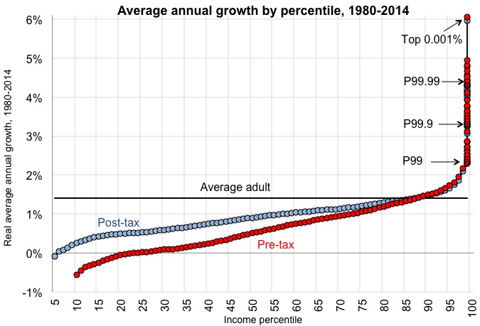
What the graph shows is that top incomes increased massively between 1980 and 2014, while the incomes of other groups grew much more slowly, with the vast majority of adults experiencing income gains below the national average.