The Labor Day Graph That Says It All

A reminder that if we hope to ever rebuild an economy that works for everyone, we need a much stronger labor movement.

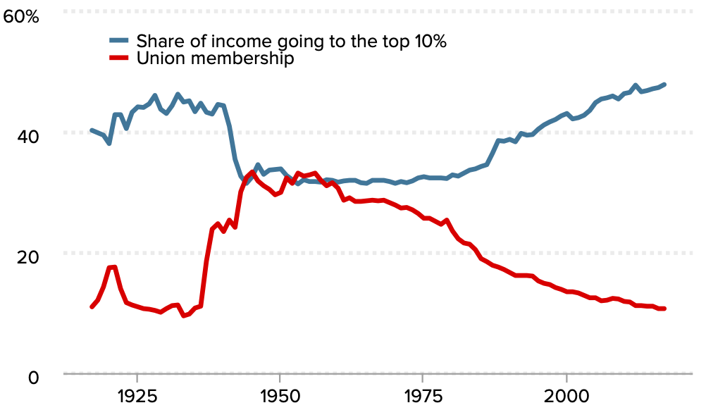
Union membership and share of income going to the top 10%, 1917–2017. (Economic Policy Institute)

We shared the above graph last Labor Day — but it’s so important, we want to share it again.

Please spread this information far and wide, since this is data everyone should see on our annual celebration of the labor movement.

The above graph comes from the Economic Policy Institute. It shows the relationship between union density and the percentage of national income going to the richest 10 percent of Americans. As you can see, the larger the share of the American workforce that’s unionized, the lower the share of national income that goes to the superrich — and vice versa.

I’ve also combined the union density graph with another from EPI showing the break between worker productivity gains and worker compensation gains. It tells an important story about what happened between 1948 and 2017.

Before around 1980, worker productivity and compensation steadily increased as union membership grew and remained relatively high. Then when union membership declined, there wasn’t a sharp uptick in productivity (the rate of gain remained roughly the same from the days of stronger unions). The thing that changed was workers’ compensation.

With less union strength, workers simply started getting paid less. With fewer unions, workers’ productivity gains that had previously been compensated were instead pocketed by owners and shareholders. (For more on this phenomenon, read this terrific backgrounder.)

Yes, wages have recently increased a bit — but the overall point still stands.

Forward these graphs to your family and friends. Tweet it. Post it on your social media feeds.

On this Labor Day, tell as many people as you can that if we hope to ever rebuild an economy that works for everyone, we need everyone to remember that there is power in a union.

You can subscribe to David Sirota’s investigative journalism project, the Daily Posterhere.

Share this article

Contributors

David Sirota is editor-at-large at Jacobin. He edits the Daily Poster newsletter and previously served as a senior adviser and speechwriter on Bernie Sanders's 2020 presidential campaign.

Filed Under