The Architecture of Prisons Is Everywhere We Look

Buildings’ design communicates the values of a society. In contemporary American architecture, those values appear closer to control and surveillance than openness and enjoyment for all.

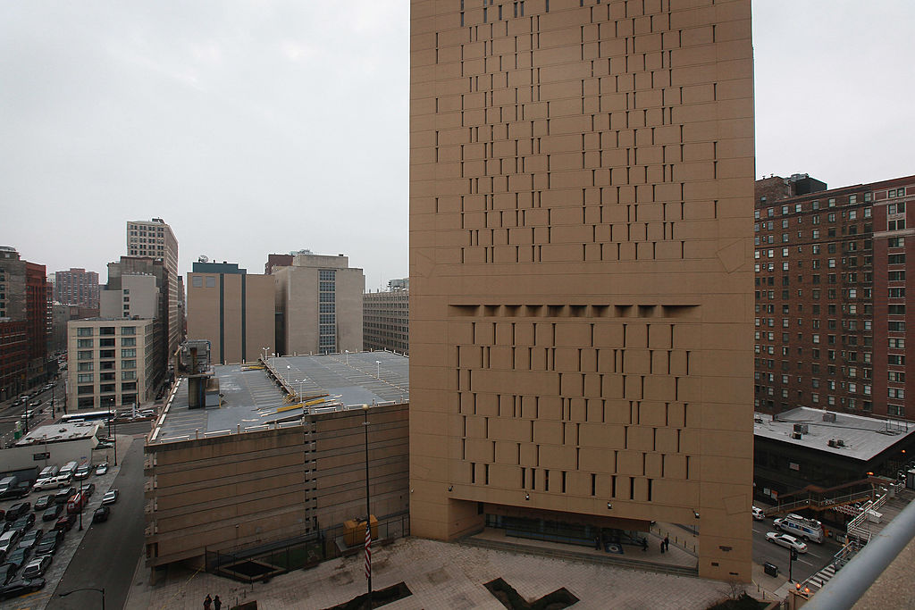
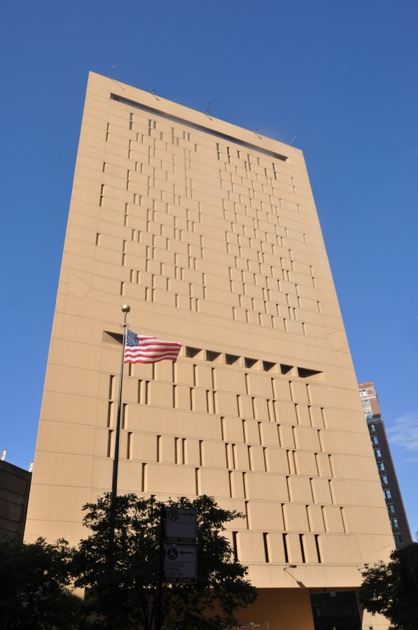
The federal Metropolitan Correctional Center in Chicago, Illinois. (Scott Olson / Getty Images)

There is a federal prison in downtown Chicago, the Metropolitan Correctional Center, that is celebrated by architects because it “doesn’t look like a prison.” That fact hardly matters to the people inside, of course — the building is still a prison. But the Harry Weese–designed edifice is undeniably more thoughtfully devised and strikingly detailed than most publicly funded buildings today.

MCC Chicago’s distinguishing features, in addition to its rooftop exercise yard, are its triangular footprint and the shape of its windows. The triangular configuration is a straightforward move that accomplishes a lot — it sets the building back from Van Buren Street, shielding it from street noise and from the elevated trains that run along that major thoroughfare. It also reduces the required length of internal corridors and maximizes the ratio of vertical to horizontal surface area, admitting more natural light through the windows.

The Metropolitan Correctional Center in Chicago. (Wikimedia Commons)

These windows are tall, thin openings that read as elegant slits in the building’s facade. Seven feet in height but less than six inches in width, they are not wide enough to require bars, making the cells (in theory) feel less prisonlike from the inside. The apertures are also beveled, meaning that they cast less shade toward the inside of the building and allow more light to stream in.

Built in 1975 and designed to accommodate a maximum of four hundred inmates, MCC Chicago currently houses 641. Steel double bunks have replaced the built-in hardwood beds that once made the cells more hospitable than those of the average prison, and matching wood desks have also been removed. The windows still stretch from floor to ceiling, but the clear glass has been replaced with frosted panes, meaning that both sunlight and views of the outside world are considerably obstructed. From the outside, it looks the same, but inside, it’s significantly less humane than its original design intended.

It’s a humorous irony that architects are attracted to a prison that superficially “does not look” like one, when so many works of contemporary architecture are regularly compared to prisons. In recent years, Brutalism, an architectural style born in the mid-twentieth century that made heavy use of exposed concrete and monolithic shapes, has enjoyed a bit of a renaissance. Coffee table books and Instagram accounts have been made in appreciation of this style, but most of the reactions I continue to hear are that these buildings look like prisons.

The association is not totally unfair. Contemporary architectural education is a generally apolitical and asocial experience wherein, aesthetically, almost anything goes. Anything can serve as what is, in architecture parlance, called “formal precedent,” which is a jargony way of saying “inspiration.” Shapes, paintings, colors, other buildings, concepts — all are taken as fair and equal fodder for design, and often out of context.

Giovanni Battista Piranesi, The Gothic Arch from Carceri d’invenzione (Imaginary Prisons), ca. 1749–50.

Giovanni Battista Piranesi’s sixteen engraved prints of imaginary prisons, called the “carceri d’invenzione,” are presented frequently in architecture schools as examples of the sort of spatial layering and depth architects should aim to produce with their building designs. Despite their gloomy bleakness and claustrophobia-inducing tightness, they often serve as inspiration for designers. In architecture school, I was introduced to the concept of the “panopticon” not as a critique of the state but as an interesting premise for ordering space.

Earlier this year, I asked people on Twitter for examples of buildings that reminded them of prisons, half-expecting most answers to be works of contemporary architecture. I predicted a deluge of concrete Brutalist buildings. While there were more than a few of these among the several dozen responses, the overwhelming connecting thread was not material but purpose: most of the buildings people thought looked like prisons were educational facilities.

High schools, middle schools, college classroom buildings, libraries, dorms. Many of them looked monolithic and menacing from the outside, had few windows and long corridors, and were clad in drab finishes like cinder block painted gray. Several people had anecdotes about rumors of their high schools or colleges being modeled after prisons or designed by architects who had also constructed prisons — and while most of those stories are probably nothing more than legend, it’s just as likely that some of them are true. Many large institutional architecture firms design everything — schools, libraries, hospitals, prisons — using similar principles and material palettes.

Public buildings — all buildings — perform social functions; they organize people and their activities. Prisons remove people from their environment and therefore their humanity; they discipline and isolate. In a capitalist state, where schools are charged largely with creating orderly and disciplined future workers, it follows that they would share their form with prisons.

Architecture serves as a billboard for the priorities of its commissioners — and generous, welcoming public buildings are low on their list. That’s how we end up with schools and libraries that look like prisons — and prisons that don’t.