Over Half of Households Are Having Trouble Paying Their Bills
Things may not be trending in the right direction for workers in the United States.

Despite rising employment, US households are finding it harder to pay their bills. (Getty Images)
Since April 2020, the Census Bureau, in collaboration with several other official statistical agencies, has been conducting a biweekly survey of people’s material well-being called the Household Pulse Survey. It asks questions about employment, income, food availability, mortgage and rent status, health, and the ease of paying bills, among other things. There’s a lot in these surveys, but for now I want to take a look at just a couple things: how hard people are finding it to pay their bills and where the money is coming from.
There have been several “waves” of this survey, and response rates and questions have varied between them, complicating longer-term comparisons. In most of what follows, I’m going to look mainly at responses since May 2021. I will say that in the months leading up to May, households found it progressively a little easier to get by than they did last summer. For example, in August and September 2020, about 44% of households said they were having no difficulties paying their bills. That rose to around 50% in May 2021. The share describing it as “very difficult” fell from about 14% to 10%. The share drawing on savings, running up the credit cards, or borrowing from friends and family fell.
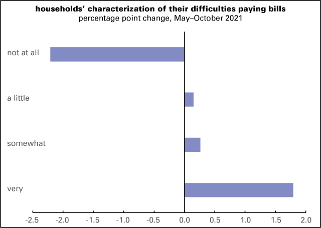
That all began turning around in May. Graphed below are the changes in households’ experience paying their bills since then. In May (averaging that month’s surveys), 49.9% of households said they had no difficulty paying their bills. In early October, that fell to 47.7%, a decline of 2.2 points. The share reporting it “a little difficult” rose slightly, and those reporting it “somewhat difficult” rose a bit more — but those reporting it “very difficult” rose from 10.4% to 12.2%. Combine “somewhat” and “very” and it rises from 26.6% to 28.6%. These are not massive changes, but they’re not what you’d expect in a period when employment rose by 2.6 million jobs.

And, as the next graph shows, there are some distressing changes in where the money’s been coming from. There’s been a rise in those reporting “regular, like pre-pandemic,” which is what you’d expect in a period of rising employment. But there’s also been an increasing reliance on borrowing, liquidating assets, and government aid (other than unemployment insurance, which has been deeply cut, and stimulus payments, which are a fading memory). It’s good the government aid is there, but given the cheesiness of the US welfare state, there’s typically not much of it.
These are not enormous changes — a few percentage points (though every percentage point shift represents about 2.5 million adults). But they’re mostly in the wrong direction.