Six Takeaways From India Walton’s Historic Victory in Buffalo
Here is a data-driven look at how democratic socialist India Walton won Buffalo’s mayoral primary, and what her coalition really looks like.

India Walton’s victory in the Buffalo Democratic primary tells a tale of two cities. (Courtesy India Walton for Mayor)
As clichéd as it sounds, Buffalo’s historic June 2021 primary, in which democratic socialist India Walton won a major upset over four-term incumbent Byron Brown, is something of a tale of two cities. And it’s the same tale that Buffalonians have discussed for generations: the “East-West divide” carved by Main Street through the heart of the city.
According to Anthony Armstrong, founder of Make Communities and coauthor of the Racial Equity Dividend report for Buffalo-Niagara, the “‘Main Street divide’ is real, and it is stark.” The predominantly African American East Side of Main Street is the product of decades of redlining and disinvestment. West of Main Street, by contrast, is made up of many of the city’s most walkable, amenity-rich neighborhoods like Elmwood and Hertel, which are both disproportionately white and affluent, in addition to the city’s most racially diverse neighborhoods.
At first glance, the primary appears to have broken mostly along these lines. The map below depicts Buffalo’s election districts according to which candidate won a plurality or better of votes cast. Data was obtained from the Erie County Board of Elections’ (BOE) results portal on June 30, 2021, and joined to Erie County’s election district spatial data layer in a geographic information system. Seemingly for economy, the BOE occasionally combines data from nearby election districts when reporting results. The following map accounts for all such combinations.
The highlighted line that runs from the Allentown and Fruit Belt neighborhoods to the northeastern boundary of the city is Main Street. With a handful of exceptions, Democratic voters located West of Main Street who turned out in the primary went, on balance, for Walton; those who turned out East of Main Street went, on balance, for Brown. One notable exception to this pattern occurs in the Fruit Belt, where Walton cofounded and directed the Fruit Belt Community Land Trust and predictably performed well with voters. Other exceptions include, for Walton (from north to south), University Heights, Schiller Park, most of Genesee-Moselle, the northern half of Lovejoy, parts of Broadway-Fillmore, parts of Seneca-Babcock and the First Ward, and most of Seneca-Cazenovia. For Brown, exceptions west of Main Street include Black Rock, Riverside, and West Hertel in the north, and the Waterfront Village area west of the Lower West Side.
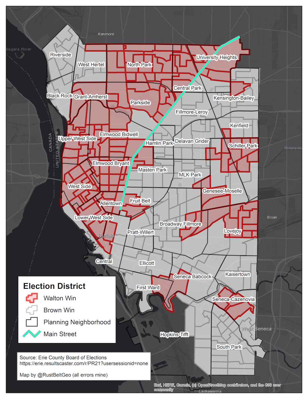
Now, it’s too early for most data analysts to access the voter file that we could use to map individual voters and explore the distribution of exactly who turned out and where they live (I requested the file from the state BOE and am awaiting a reply). Nor do we have reliable exit-poll data to describe voters who turned out for each candidate. But, if we can’t statistically profile each candidate’s voters, we can at least describe characteristics of the geographic areas that each candidate won to get a sense for who might be supporting whom.
The remainder of this post does some relatively basic profiling using census block-group level data for 2019. The objective is to paint an initial picture of how the “tale of two cities” narrative is reshaping Buffalo’s political landscape, and what it might mean for November and beyond.
Takeaway #1: Historically Reliable Strongholds for Brown Failed to Turn Out
Taken together, the areas won by Walton contain roughly 49.5% of Buffalo’s total population. By that measure, we might make the naive statement that Walton and Brown each won about half the city. Of course, not all Buffalo residents can participate in a Democratic primary. Looking to the most recent voter registration data from the New York State BOE, areas won by Brown enjoy a sizeable enrollment advantage among registered Democrats. Active Democratic voters in Brown-won territory outnumber their counterparts in Walton-won territory by nearly 23,000 (161,756 to 138,915).
One way that Walton overcame this enrollment disadvantage was with an aggressive ground game, bolstered by her “strong community presence, bold ideas, and the backing of electoral experts,” through help from Democratic Socialists of America activists and especially from within the Working Families Party political apparatus. Combining those ingredients into a tight and well-organized campaign got voters to the polls, plain and simple. Turnout in Walton-won districts was 3 percentage points higher (21.5%) than the lackluster participation in Brown-won territory (18.5%). In a recent interview with Geoff Kelly for the Investigative Post, University at Buffalo professor Henry Louis Taylor Jr suggested that low turnout in former Brown strongholds amounted to a protest. To Dr Taylor, “There were people in the black community who couldn’t stomach Brown but didn’t believe India could win . . . so they just stayed home.”
Now that Walton has demonstrated she can win, and Brown has committed to staying in the race as a write-in candidate through November, reaching those disaffected or “protest” nonvoters could be one of the keys to winning the general election. At the same time, retaining and building on the momentum generated in areas with higher turnout will be necessary for Walton to withstand the pressure of a well-funded, newly motivated candidate with universal name recognition. Toward those ends, it might be useful for observers watching the race to know a little more about who lives in each of these “two cities” that are about to choose the next mayor of Buffalo, and potentially reshape the Western New York political landscape for years to come.
Given the limited data available to me at the moment, below I look at how Buffalonians are split between Walton-won and Brown-won territories. I examine these splits for just a handful of demographic and socioeconomic variables, before synthesizing the results and speculating on their implications for Buffalo’s future.
Takeaway #2: Districts That Walton Won Contain a Majority of Buffalo’s Renters
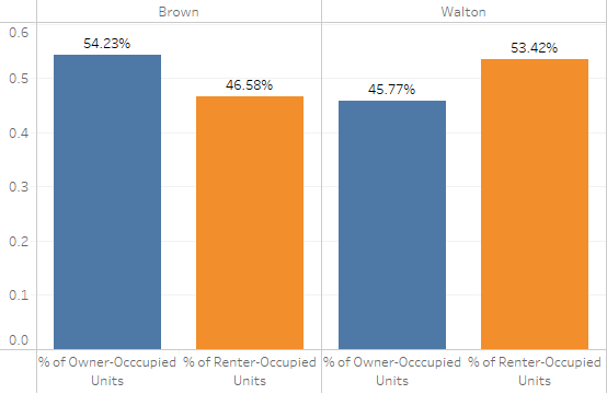
To begin, consider housing tenure. Housing has been one of Walton’s signature issues since her campaign launch. Among her “first 100 days” campaign promises is to sign a tenants’ “bill of rights that would install a tenant advocate and institute rent control.” It’s a message that ought to resonate with renters, especially in Buffalo, where the housing cost burden is perpetually high and convincing evidence exists that tenants are being exploited. The graph below shows how Buffalo’s households are divided into Brown- (left) and Walton-won (right) territory by housing tenure. Somewhat expectedly, the majority of Buffalo’s renter households (53.4%) are situated in spaces where Walton won. That’s not to say that Walton won the majority of renters who turned out to vote (though there’s no reason to doubt that’s the case); instead, it’s saying she won in places where the majority of the city’s renters live.
(Note to the reader: All of the following graphs show how certain population or household subgroups within the city are divided between Brown- and Walton-won areas. The graphs can be easily understood by summing bars of the same color. In the tenure example, when the 53.42% value for renter-occupied units in Walton-won territory is added to the 46.58% value for renter households in Brown-won territory, we account for 100% of renter households. That’s how it’s possible to say, for example, that most of Buffalo’s renters live in spaces won by Walton.)
Takeaway #3: Walton Won in More Racially Diverse Neighborhoods
The next graph performs the same type of analysis for race-ethnicity. The eight main population subgroups tracked by the census and included in the figure are (1) White, (2) Black, (3) Hispanic, (4) Asian, (5) Indigenous, (6) Native Hawaiian or Pacific Islander, (7) “Other,” or identity with one race not represented in the census’s available categories, and (8) Multiple racial identities (“Two or more races” in census records). Except for subgroup (3), all persons represented in the chart identify as “Not Hispanic” when asked about their ethnicity by the Census Bureau. Members of group (3) — Hispanic persons — also identify with one or more racial groups when responding to the census; however, they are included only in category (3) here to avoid double counting.
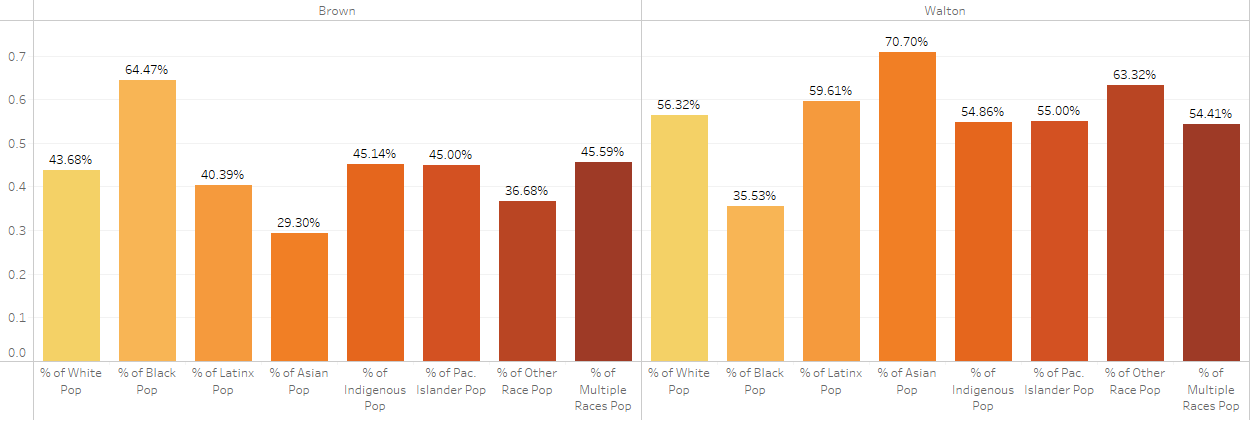
Whereas only 35% of Buffalo’s (non-Hispanic) black or African American population lives in areas won by Walton, Walton-won territories contain the majority of residents from all other racial and ethnic groups. At face value, the graph therefore suggests that Walton lost in many segregated, relatively homogenous African American neighborhoods, but won in more diverse and multiracial communities. One way to test the validity of that claim is to measure the degree of racial-ethnic diversity in Walton-won versus Brown-won territories.
There are numerous ways to accomplish this goal. I’ll focus on just one popular diversity index that measures the probability that two persons selected at random in the same area belong to different racial-ethnic groups. The index ranges from 0 — when a neighborhood is completely homogenous — to 100, when every person in a neighborhood identifies with a different racial-ethnic group. I collected values of this index for all census block groups in Buffalo and assigned each block group to Walton-won or Brown-won territory based on the block group’s geographic center point. The graph below shows the resulting median block-group diversity index values based on the winning candidate. Matching expectations, the median diversity index in Walton-won territories is 57.8, 1.6 times greater than the median value of 35.5 in Brown-won areas. (For those who care about such things, the difference is highly statistically significant, meaning that it cannot be explained by chance alone.)

Takeaway #4: Walton Won in Districts With Millennial Majorities, but Lost in Districts Where Most Older Residents Live
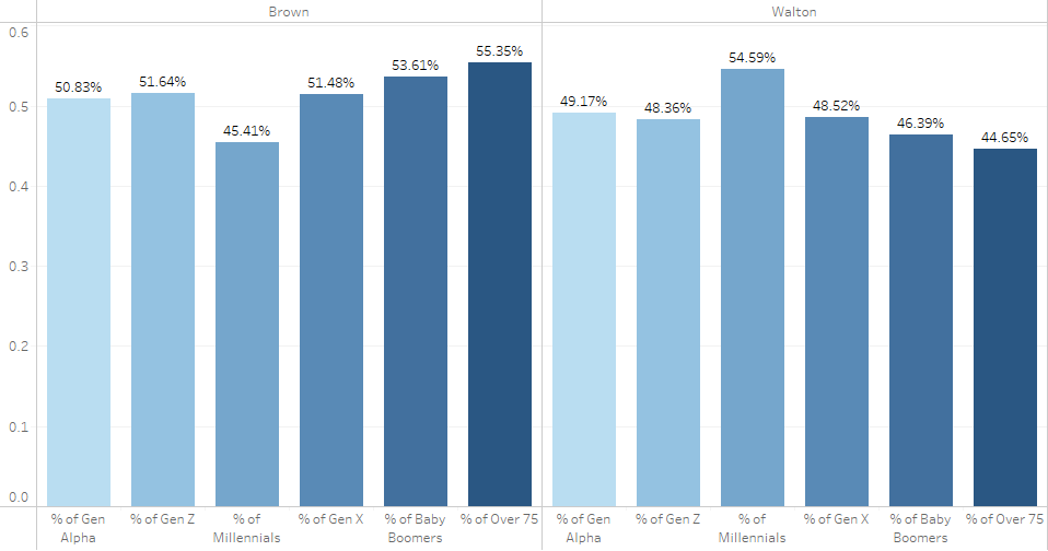
The next graph shows how Buffalo residents split between Brown- and Walton-won territory when grouped by age. Age groups are summarized using the following generational labels:
Generation Alpha (born 2017 or later)
Generation Z (born 1999 to 2016)
Millennial (born 1981 to 1998)
Generation X (born 1965 to 1980)
Baby Boomer (born 1946 to 1964)
Over 75 (born 1945 or earlier)
Of these categories, Millennials are currently the largest age cohort in Buffalo, making up about 28% of the population. They are followed by Gen Zers (23%), Baby Boomers (20%), Gen Xers (18%), persons Over 75 (6%), and, finally, members of Gen Alpha (4%). Thus, despite being the principal city in an aging region, more than half of Buffalo’s residents are forty years or younger.
The relevance of age comes into play when considering Walton’s unapologetic use and embrace of labels like “socialist.” According to Gallup, attitudes toward socialism differ wildly by age. Among Millennials and Gen Zers, socialism is as popular as capitalism; but the term is strongly negative for Gen Xers, Baby Boomers, and persons over 75. While I’ll return to this point shortly, observe below that spaces that Walton won contain a majority of Buffalo’s Millennials, but disproportionately few members of older generations. Put another way, if national trends apply to Buffalo, then the city’s older residents, who are most likely to hold negative views of socialism, are relatively concentrated in spaces that voted for Brown. That’s probably not a coincidence.
Takeaway #5: Walton Won in Well-Educated, Mixed-Income, and Affluent Neighborhoods
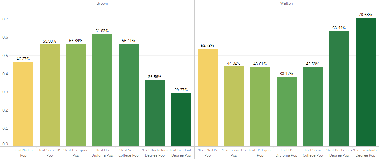
Finally, let’s consider education and income together, since the two characteristics tend to be highly correlated. The first of the two immediately following charts shows that supermajorities of the city’s college- and graduate-school–educated residents live in areas won by Walton. At the other end of the spectrum, about 54% of the city’s adults who lack any high-school education live in Walton-won districts. These patterns fit with national surveys showing that positive views of “socialism” peak at the top and bottom ends of the educational attainment spectrum.
That being said, adults with no high-school education constitute the smallest educational attainment group in Buffalo, at only around 5% of persons twenty-five years or older. College- (17%) and graduate school–educated (13%) adults are much more numerous, combining to make up 30% of persons twenty-five years or over. Consequently, profiles of Walton-won territory will naturally take on more attributes of these latter (highly educated) groups relative to the former.
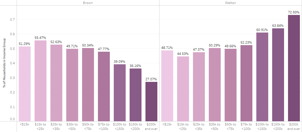
As a case in point, the second figure below shows how households split between candidate territories with respect to household income. Linking the findings to educational attainment, which correlates directly with income, supermajorities of households at the upper end of the income spectrum — earning $100,000 or more per year — live in Walton-won districts. Notably, Walton-won districts also contain simple majorities of moderate- and middle-income households earning $35,000–$50,000 and $75,000–$100,000. However, most households that earn below the city’s median household income (currently around $37,000) live in spaces won by Brown.
That result is somewhat surprising given Walton’s unambiguous advocacy for low-income and working-class persons and families, though an explanation might lie in the aforementioned age structure of the population in the low-income districts where Brown won.
On that note, the city that Walton won appears, at face value, to be a younger, more racially diverse, well-educated, mixed-income Buffalo, where residents have a greater tendency — whether by choice or necessity — to rent their homes.
Rounding out the tale, the city that Brown won is a comparatively segregated, predominantly African American Buffalo, situated almost exclusively east of Main Street, where somewhat older residents with lower educational attainment (on average) live in relatively low-income households, which they have a greater tendency to own rather than rent. According to Taylor, it’s a city disconnected from the Buffalo that many claim to be in renaissance: whatever “renaissance” has happened or is happening, he suggests, “hasn’t benefited poor people of color or the neighborhoods where they live.”
Takeaway #6: Walton’s Victory Might Signal a Break in Buffalo’s Main Street Divide
Taylor’s characterization of the conspicuously low turnout in Brown-won territories (and historically reliable Brown strongholds) as a “protest no-vote” is, to me, not only a sharp analysis but also a potential sign of what’s to come.
For one, Buffalo is changing, and it offers hope that left-wing political coalitions can win through a progressive social program that unites working people across racial and geographic boundaries. Voters in the city that Brown won made room for an emerging shift in Buffalo’s political landscape. Now it is up to this new coalition to deliver the goods for them.
Thirty years ago, writers in the Buffalo News referred to Main Street as “Buffalo’s very own Berlin Wall.” That wall was erected and fortified using decades of neoliberal policies and development strategies. Perhaps the election of a democratic socialist mayor will help the two Buffalos become one.